


There’s never been a better time to learn to spot when data is lying to you.
Executives across Australia are making tough decisions daily, especially in the current economic and political climate. Although boards might have the best intentions of being data driven, this doesn’t prevent bad actors from misleading boardrooms with deceptive visualisation and communication of data.
Executives need to be driven, not deceived, by data when making the decisions that are shaping the recoveries of their organisations, and our economy. This article will explore a few telltale signs that can help you identify deceitful data before it affects your decision-making process.
Where do they draw the line?
Whenever you see any chart – look at the axis before you look at the chart itself. These lines are often overlooked, but they give so much context – in a best-case scenario, looking at the axis will help you understand a truthful visualisation even better, and in a worst-case scenario looking at the axis will be an immediate red flag to show that the chart might mislead you.

Brooke Jamieson. Photo: supplied
Pay close attention to the numbers at the start and end of each axis – changing these numbers really changes your perspective in viewing data. Think of an iceberg – if you could only see what was above the waterline, you wouldn’t know what was beneath. Changing the Y-axis is like moving this waterline up and down – so the part of the iceberg you see could look very different.
And this is just when we’re talking about one chart – but this really compounds when you are comparing multiple charts. Our brains are great at interpolating missing information to tell a complete story, and they can use this against us. For example, if there are two charts presented side by side, it’s natural for our brains to impulsively compare and contrast the visualisations.
However, an age-old trick of dodgy data viz involves “carefully choosing” the range of each axis (i.e. deliberately selecting the axis range to mislead viewers) on each chart to nudge the viewer to arrive at a conclusion that is completely false. For example:

So at first glance, it looks like the New Marketing Strategy has increased ROI. However, if you look at the vertical axis (the Y Axis) the ROI was 40% under the old marketing strategy, and 29% under the new strategy. Even though the chart looks bigger, the ROI has dropped considerably.
The lost cause
You might have heard the words correlation and causation before – but what do they mean? In statistics, correlation means there’s a statistical relationship or association between two random variables or bivariate data. This differs from causation, where one event has caused another event.
So just because two variables (or lines on a chart) might look like they’re related, you can’t just say they are without proving this, because it could just be random or a coincidence.
This is one of my favourite examples to illustrate this point, by Tyler Vigen:
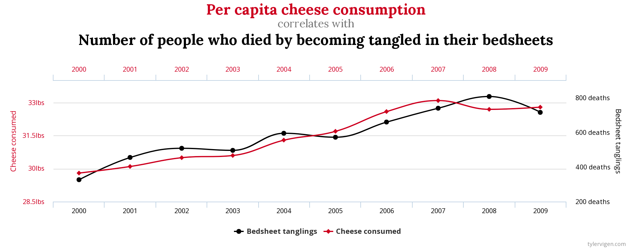
So per capita cheese consumption correlates with the number of people who died by becoming tangled in their bedsheets. Does this mean that if in future people consumed less cheese, fewer people would die in their sheets?
No! This is just a coincidence, not a cause-and-effect relationship.
Our brains will always try to connect the dots when we’re looking at a few charts at once, so be mindful of this and prevent yourself from being manipulated. Think twice before you join the dots yourself, and don’t be afraid to ask questions about correlation and causation when data is being presented to you.
Even before the pandemic and economic crisis, lots of deceptive data had found its way into the boardrooms of Australia. Knowing what to look for will help you understand how the data is being presented to you, even if you don’t quite understand the complexities of what is happening behind the scenes in the analysis to get to these results.
The decisions at hand are hard enough already, without any tricks or deception in play. Decisions driven by dodgy data visualisations and manipulated results can, and will, damage your business.
- Brooke Jamieson is Experience Lead at PlaceOS, a technology platform for creating digital experiences for buildings, workplaces, hospitals and more.


Trending
Daily startup news and insights, delivered to your inbox.