When you’re a startup, it might feel like you don’t have the time and budget to stay on the cutting edge of web and graphic design trends. But it’s important that your brand feels modern.
You don’t have to have the flashiest website or the most avant garde graphics to feel like your brand belongs in 2019. All you need to do to feel current is to find a way to make one or more of the year’s trends your own. There are a lot of graphic design trends that are going to explode this year, with one macro trend directing them all: contradictions.
In 2019, be ready to see designs that draw from opposing ends of whatever spectrum they’re playing with. It’ll be a year to face and embrace opposition as a creative force.
Fonts old and new
3D text and images
When they’re done right, 3D graphics make the viewer feel like they can reach out and touch them. The graphics you see on websites and in print are inherently flat – touch your hand to the screen and no matter what’s on it, the screen’s just going to feel like a flat screen. There’s no getting around that. But your graphics don’t have to feel flat visually.
By rendering text and images in 3D, you make viewers’ brains register them as physical, palpable, touch-and-pick-up-able. Any text can be made 3D, regardless of font or style. The same can be said for objects and collections of objects.
3D design has the added benefit of feeling futuristic, positioning your brand on the cutting edge.
Serifs
This graphic design trend is one that might fly under your radar, consciously, at least. But when you see a serif font on your screen, you’ll notice something feels a bit different. That’s because for a long time, sans serif fonts ruled the internet.
They were seen as easier to read on screen, and felt modern in contrast to serifs, which harken back to the printing press. But the serif is back, and appearing in web browsers everywhere in 2019.

If you’re not sure what a serif font is, this is a serif font. The serifs are the small lines jutting out on the ends of the letters, like the left-hand side of the capital D. Logo and brand identity design by 99designs designer Dave Roach
By opting for a serif font, you break the viewer’s expectation. Most people aren’t consciously thinking about the font they’re reading, which is why seeing an unexpected font makes them pause.
Be the brand that makes its audience take a second glance with a fresh-looking serif font.
Refreshing throwback styles
Art Deco
Art deco is the highly detailed, glossy style that first became popular in the 1920s. Think long, leggy letters in typography and shiny, metallic imagery with hard lines and a feeling of luxuriousness.
That’s Art Deco, a deliberate move away from the rustic, hand hewn designs that found their way into nearly everything in the second half of the 2010s.

People are used to minimalist designs. Give them something they don’t expect with art deco graphics. Illustration by 99designs designer Skilline
Mid Century modern
2019’s other big throwback is to the geometric shapes and patterns that defined the 1950s and 60s. Mid Century Modern design was a direct response to Art Deco.
While Art Deco design is all about being as shiny and ornate as possible, Mid Century Modern’s design philosophy is the exact opposite: form should follow function, and any part of a design that doesn’t have a purpose doesn’t need to be there.
Mid-century modern design uses clear, clean lines, often juxtaposed against softer shapes. It also uses deliberate patterns create texture to make up for the lack of other details.
For example, a human figure might be depicted without a face or any detail on their clothing, but be situated in a tightly patterned environment.
World building, big and small
Isometric worlds
Isometric design is design that shows 3D objects in 2D. It does this through shading and angles that create the sense that you’re looking at the object from a specific perspective. If you’re thinking about going 3D with your graphics but want a fun, abstract take, isometric graphics are the ideal direction for you.

Isometric design brings flat design to life. Web page design by 99designs designer Daria V
This type of design still has the clean, simple personality that made flat design so popular, but when it’s used to create objects and scenes, it gives the viewer a world they can imagine themselves inhabiting. Think flat design, but with depth.
Snippets of bigger, broader worlds
Remember when we said 2019 would be the year of contrasts in graphic design? Well, just as isometric design scales entire fleshed-out worlds down to small pages, open composition designs give the viewer the sense that they’re looking at a tiny piece of a much larger world that exists beyond the page they’re looking at.
These designs include expansive patterns that feel like they continue off-screen and potentially forever. They can feel chaotic, they can feel untethered, but when done well they’re immersive and leave you wanting more. Who doesn’t want that?
Embrace 2019 with refreshed graphics
Get a new look to celebrate the new year. Whether you choose to totally renovate your website and print materials or choose to make subtle changes in your evolving brand, making a change will show the world that your business is living in 2019.
Pamela Webber is Chief Operations Officer at 99designs, the global creative platform that makes it easy for designers and clients to work together to create designs they love. If updating your graphics is on your list of New Year’s resolutions, take further inspiration from 99designs’ list of the design trends that will define 2019.
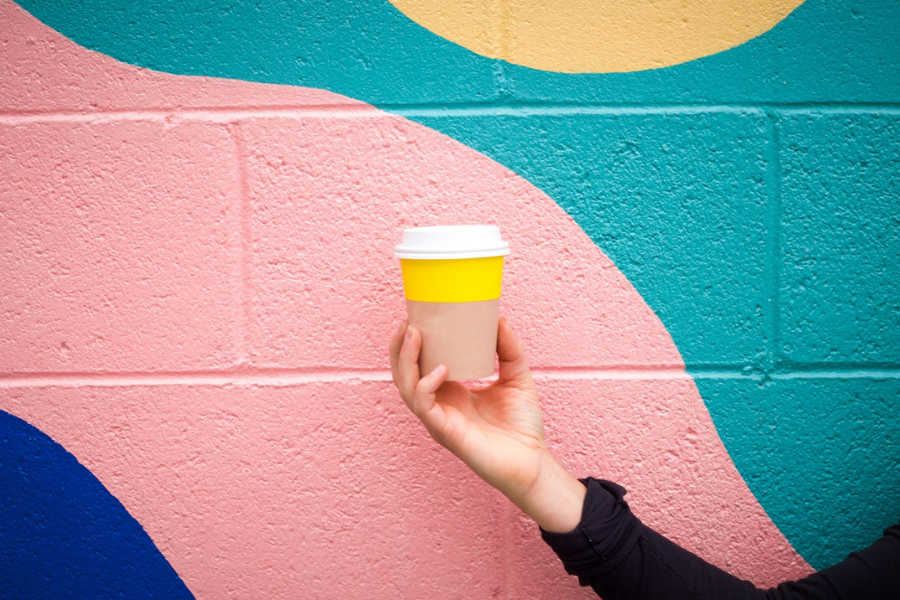
Image: by Marion Michele on Unsplash








Trending
Daily startup news and insights, delivered to your inbox.